A New Internet Home for the
Weavers Guild of Minnesota
Morgen Ruff
MCAD MA in Graphic & Web Design
Capstone — Fall 2025
A new internet home for the Weavers Guild of Minnesota (WGM), one of the state’s longest-running arts nonprofits, founded in 1940 by a group of textile weavers led by Hilma Berglund. Offering robust, year-round classes & workshops on many handmade textile weaving, spinning, and dyeing methods, WGM — and organizations like it all over the country — is a critical lifeline in the fight against industrial textile processes and consumption patterns that play a large part in advancing the climate crisis. This project aims to represent, via the web, the full breadth and depth of WGM’s vital work preserving and advancing the arts of weaving, spinning, and dyeing. Through engaging, welcoming design, a modern, resilient tech stack based on Wordpress, and a user-friendly, accessible approach to communicating information from WGM to its present and future audiences, this new website will lay a foundation for WGM’s next decade as the organization navigates an exciting period of growth and expansion.
Why?
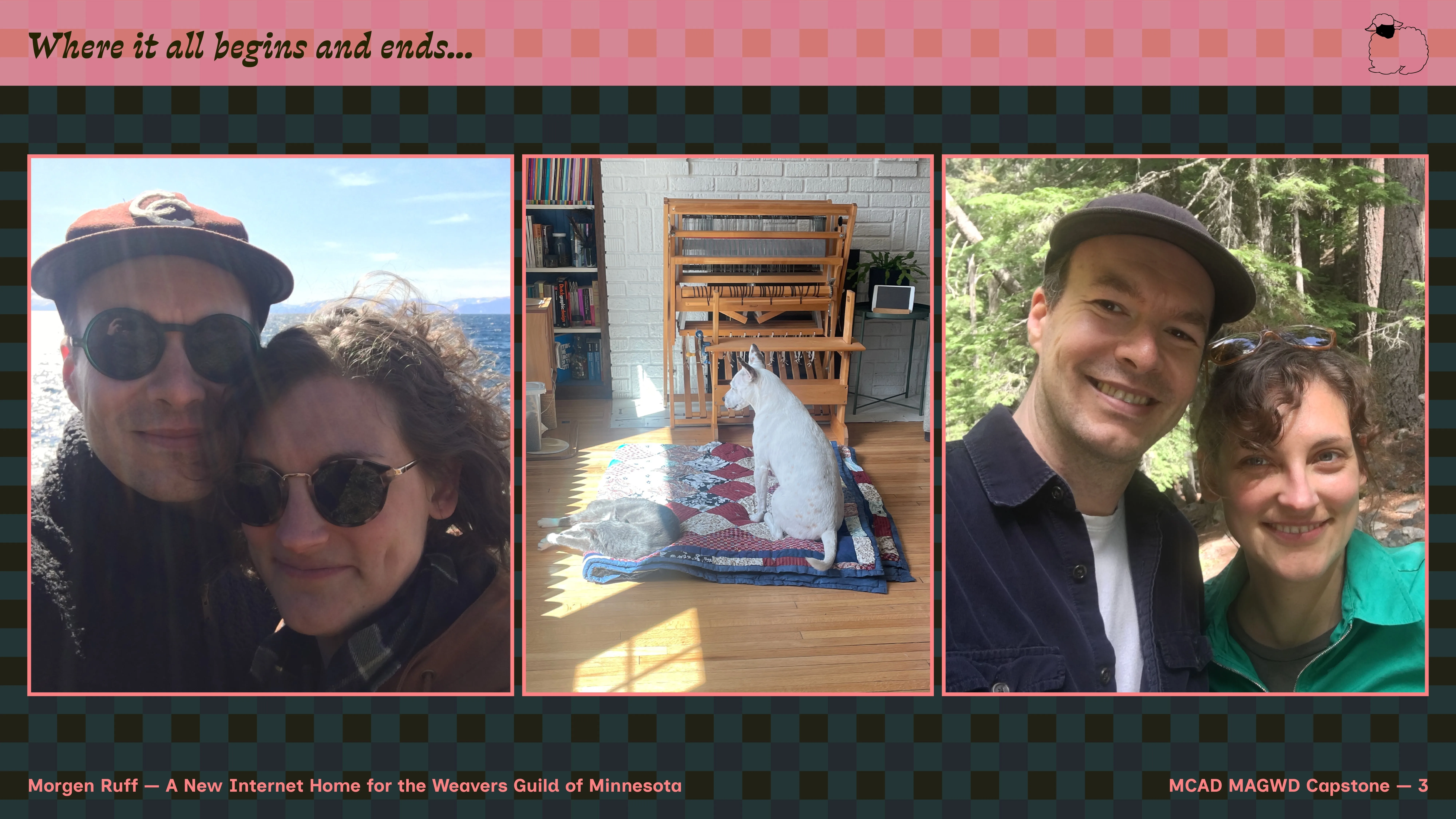
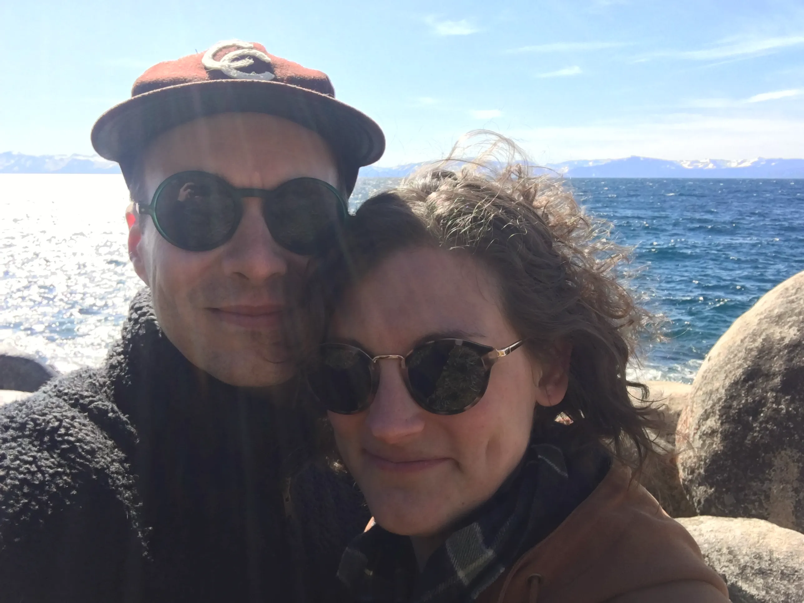
Betsy & me on a very cold day at Lake Tahoe, March 2020.
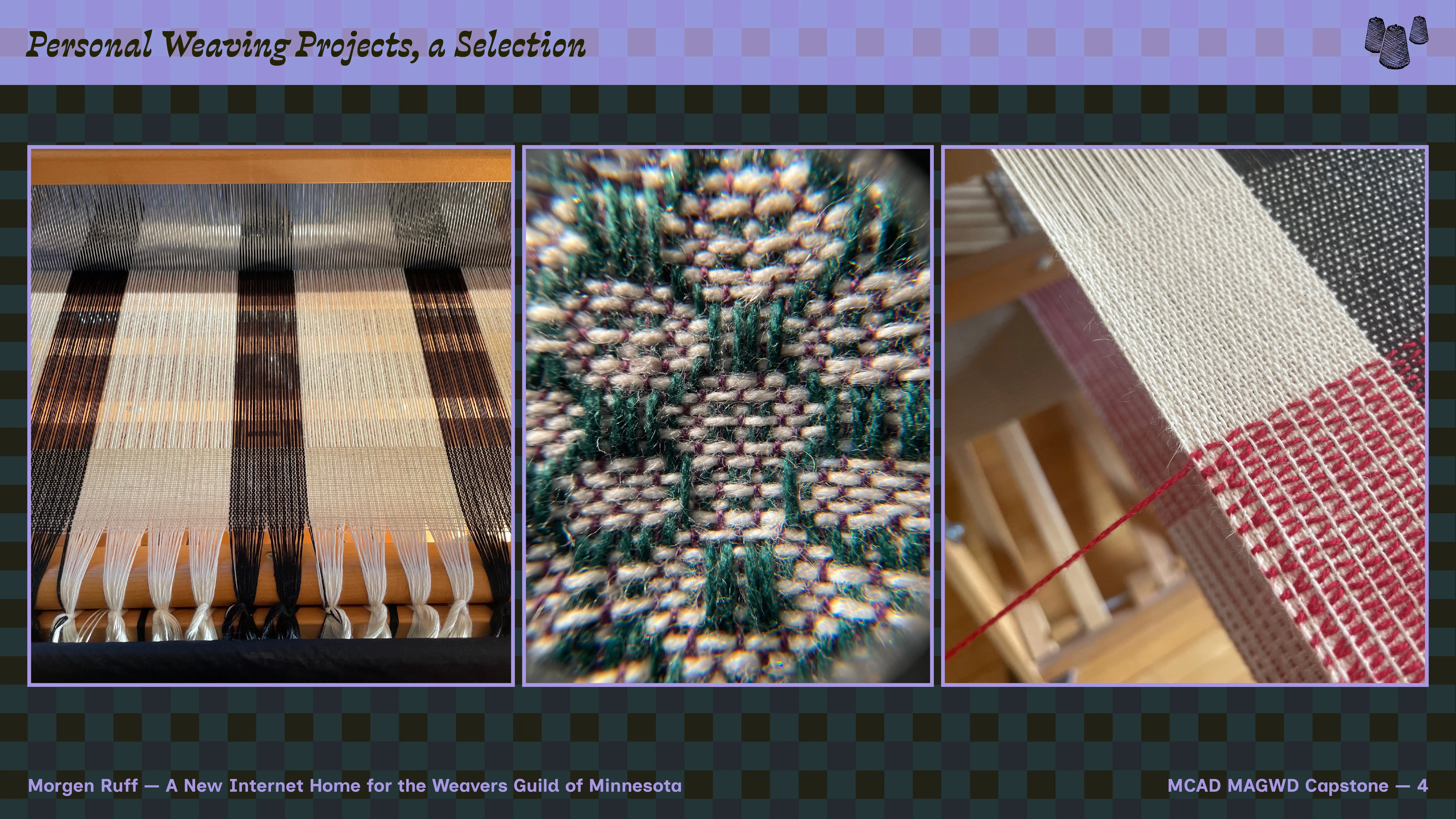
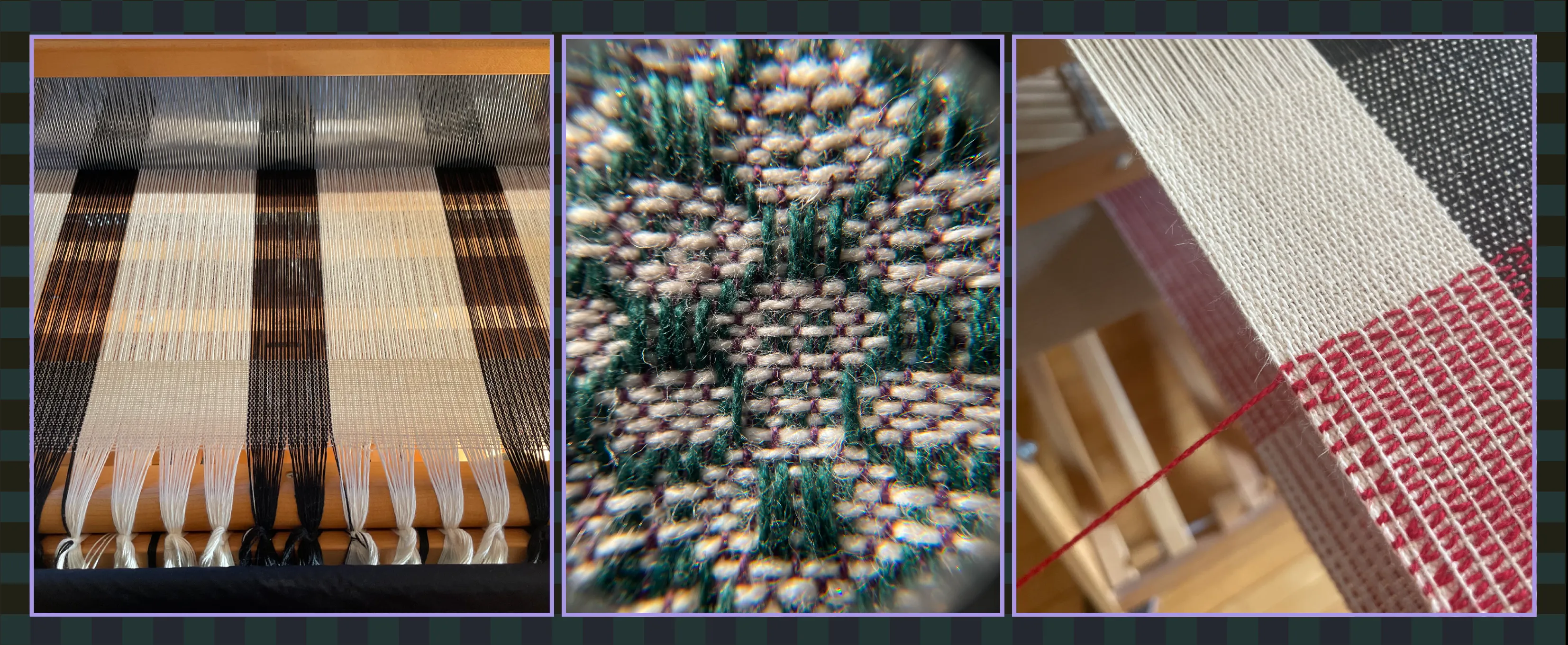
Some of my weaving projects.
For the past seven years, WGM has played a key role in my life — my partner Betsy runs the organization and I’ve spent a lot of time doing volunteer work, but it has also given me a creative outlet and community, especially during the COVID-19 pandemic. During this period, I had been laid off from my long-time job running a film festival and cinema in Portland, Oregon, had just moved to Minneapolis, and was frankly lacking community and prospects. Finding remote work during this period was incredibly difficult, and I had far too much time on my hands.
Mostly stuck inside due to the pandemic, Betsy taught me how to weave, patiently working with me to explain and nurture the details of hand-crafting textiles. Before long, I was creating projects on my own, many of which I’m very proud of. During that uncertain period, making textiles gave me a creative outlet — a very welcome change from the computer work I’m used to, and frankly a sanity-saver.
Problem
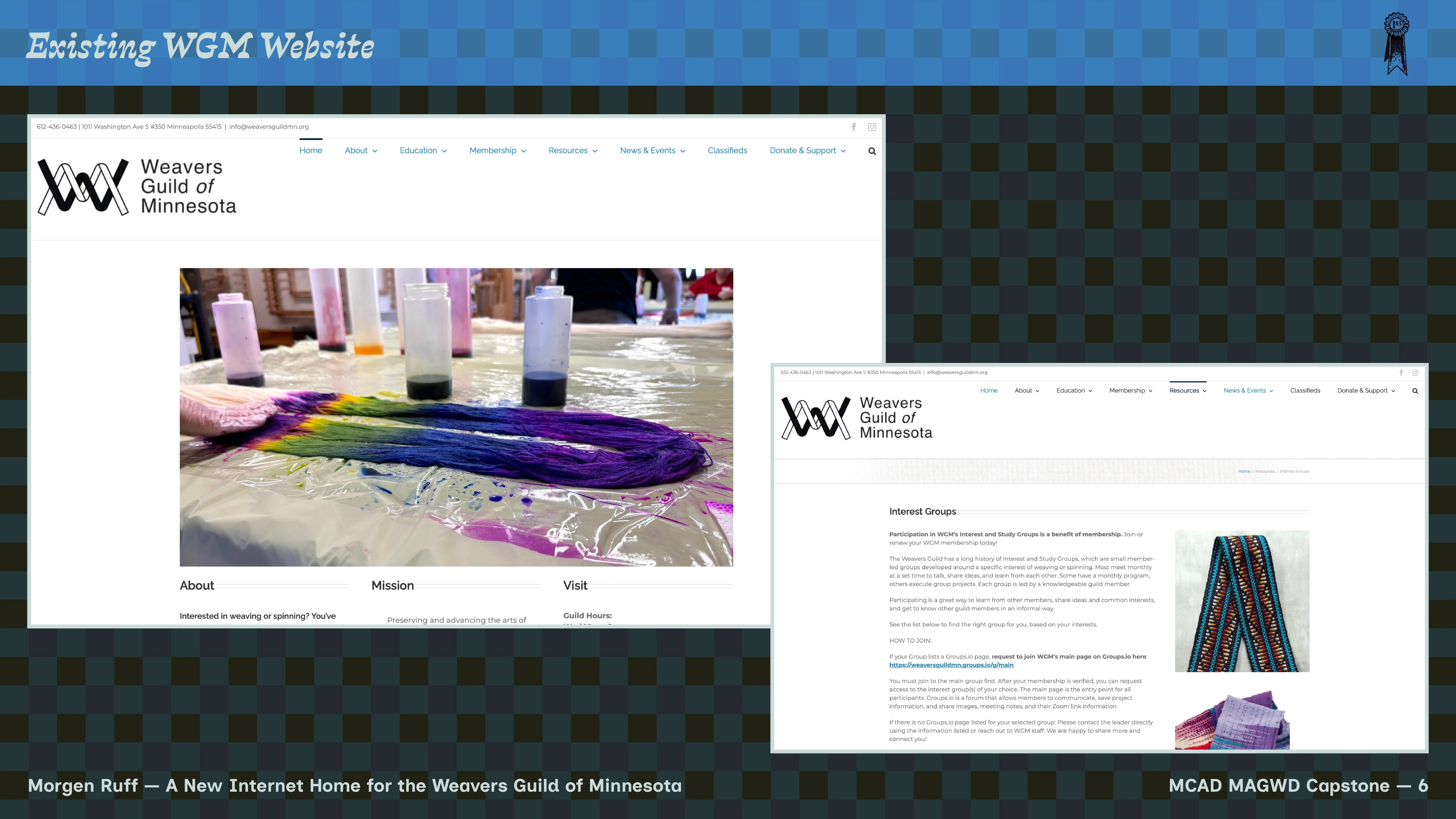
The WGM homepage as of November 2025.
Web presence is vital for any business today — people have to be able to find you to patronize you. But it’s especially important for arts nonprofits, which often lack funding for major advertising campaigns or staff bandwidth to create effective partnerships with large organizations. Their site and social media accounts are typically the only public-facing passive presence these organizations have. Moreover, due to the US political environment of the moment (late 2025), arts nonprofits across the country are experiencing budget shortfalls and targeting due to ideological differences. As an arts organization, finding your audience and letting your audience find you is both more difficult and more important than ever. The big question: how to best represent a vital organization in its community today, provide a robust experience that provides the information existing users expect, while also attracting and retaining new audiences?
In its current and soon to be former state, the WGM site works as an average user would expect, but feels outdated and sluggish, text-heavy and broadly undynamic. The site lacks modern features that are hallmarks of web experiences today: evocative images, seamless navigation, intuitive user experience, lovely and unique typography, vibrant color, and focus on accessibility for all users. Crucially, the current site also lacks any kind of e-commerce functionality, which likely substantially affects WGM’s bottom line. Finally, an important consideration is that WGM wants to continue using the Wordpress CMS as core staff are well-trained in using it.
Note in the screenshot here that the site uses a hodge-podge
of styling, with iframe embeds for certain content,
mismatched columns, odd/inconsistent spacing, and other small
problems. The site navigation is cluttered and hard to parse.
And finally, for an organization that's focused on such visual
crafts, there is a surprising lack of images.
Concept
Early project moodboard; inspiration, general direction.
Later moodboard; getting closer to the core style & feel.
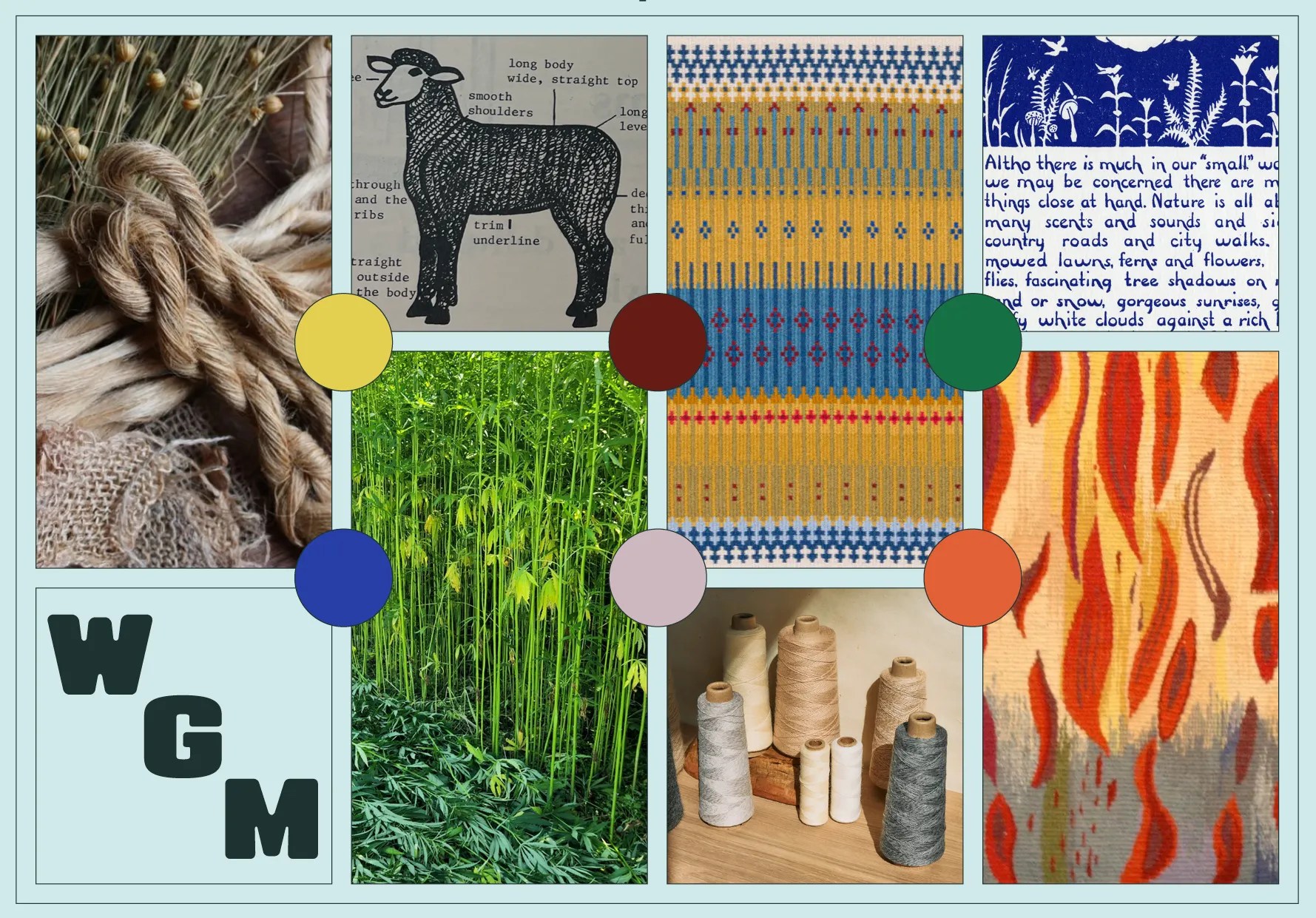
This project’s goal is to refresh and enliven WGM’s web presence, in the process doing justice to and appropriately representing the organization’s community work. Without doubt, we need a new brand color palette and a new suite of typography based in personality and legibility — in both cases, we should strive for fun, approachability, and choices that have staying power. WGM has plenty of visually-interesting work going on every day, so we also need much improved imagery across the site, in terms of both quality and quantity.
Collected Data & Research
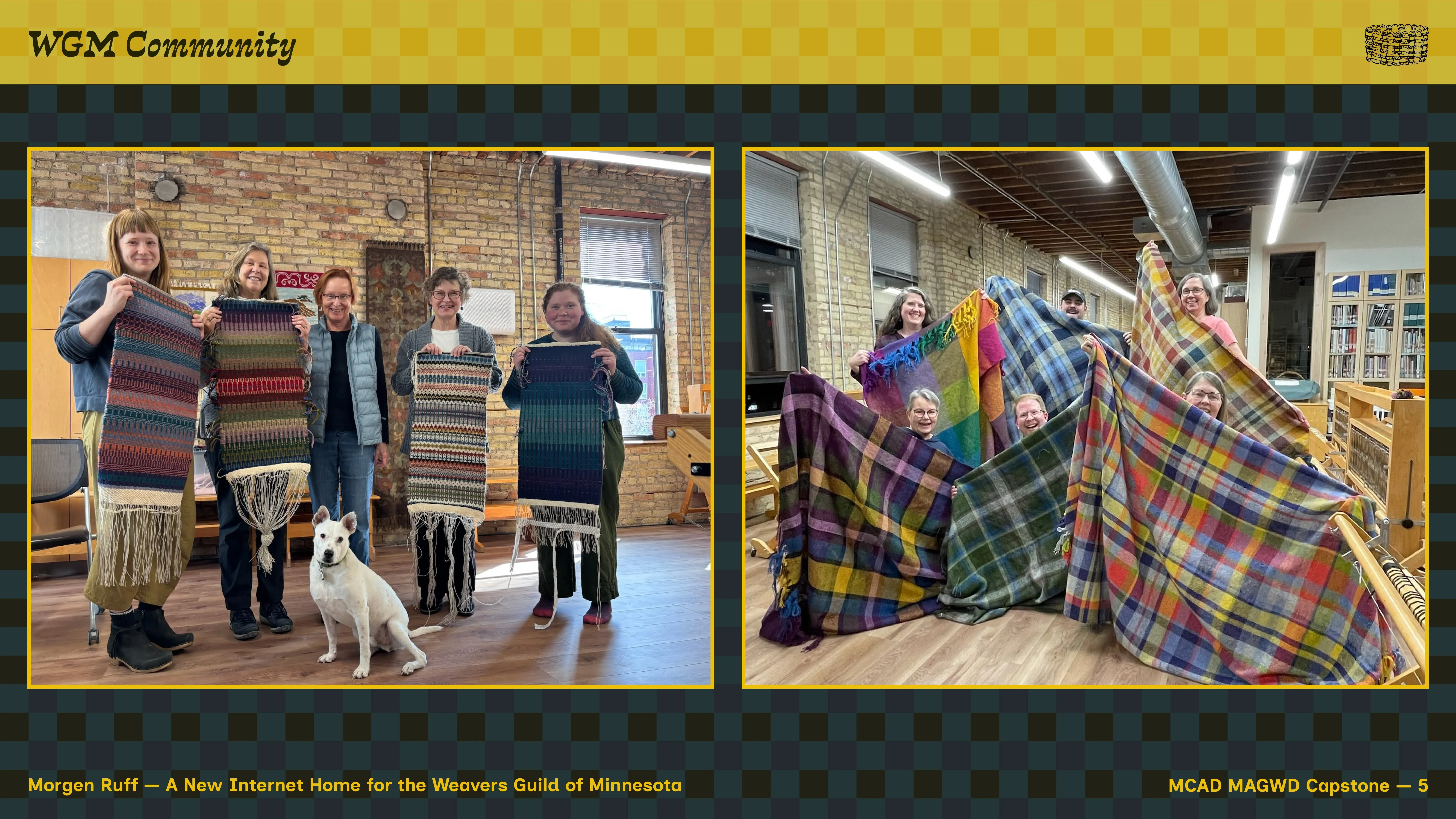
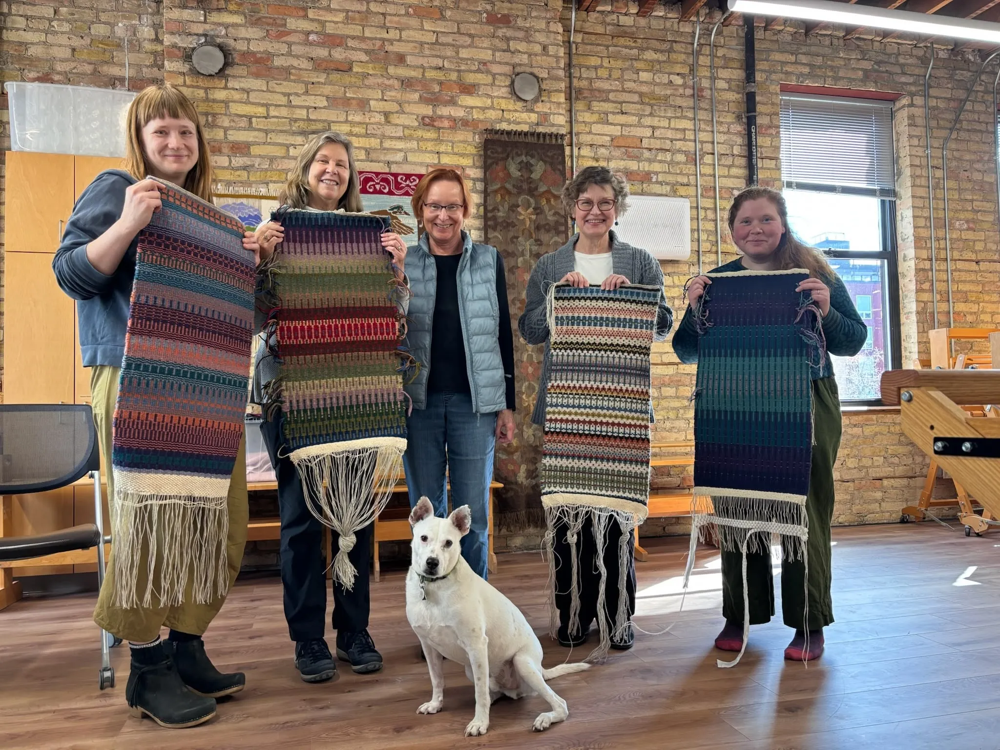
WGM class community (& Hops) with Krokbragd weaving projects. Photo by Kala Exworthy.
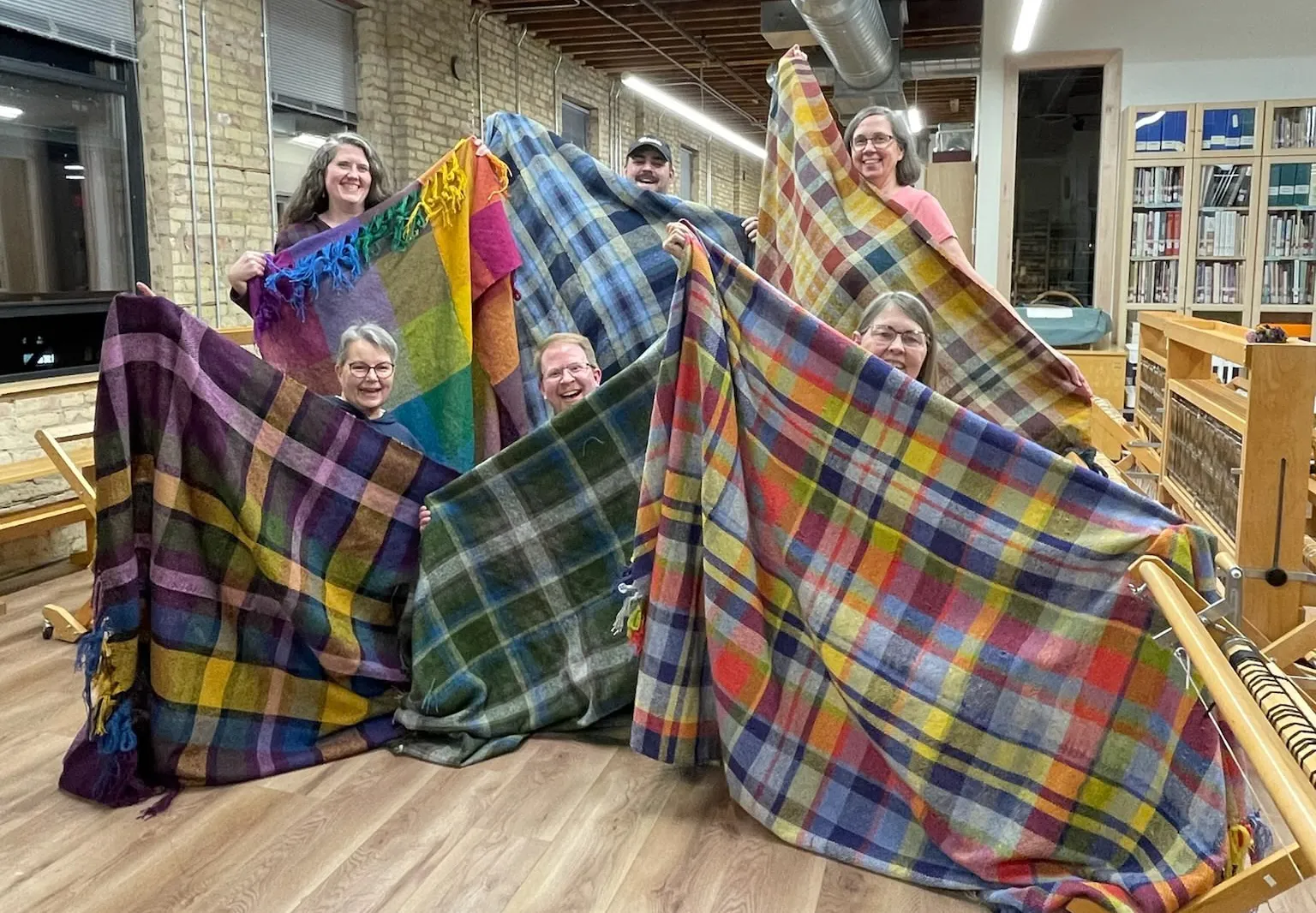
WGM class community with wool blanket weaving projects. Photo by Betsy Konop.
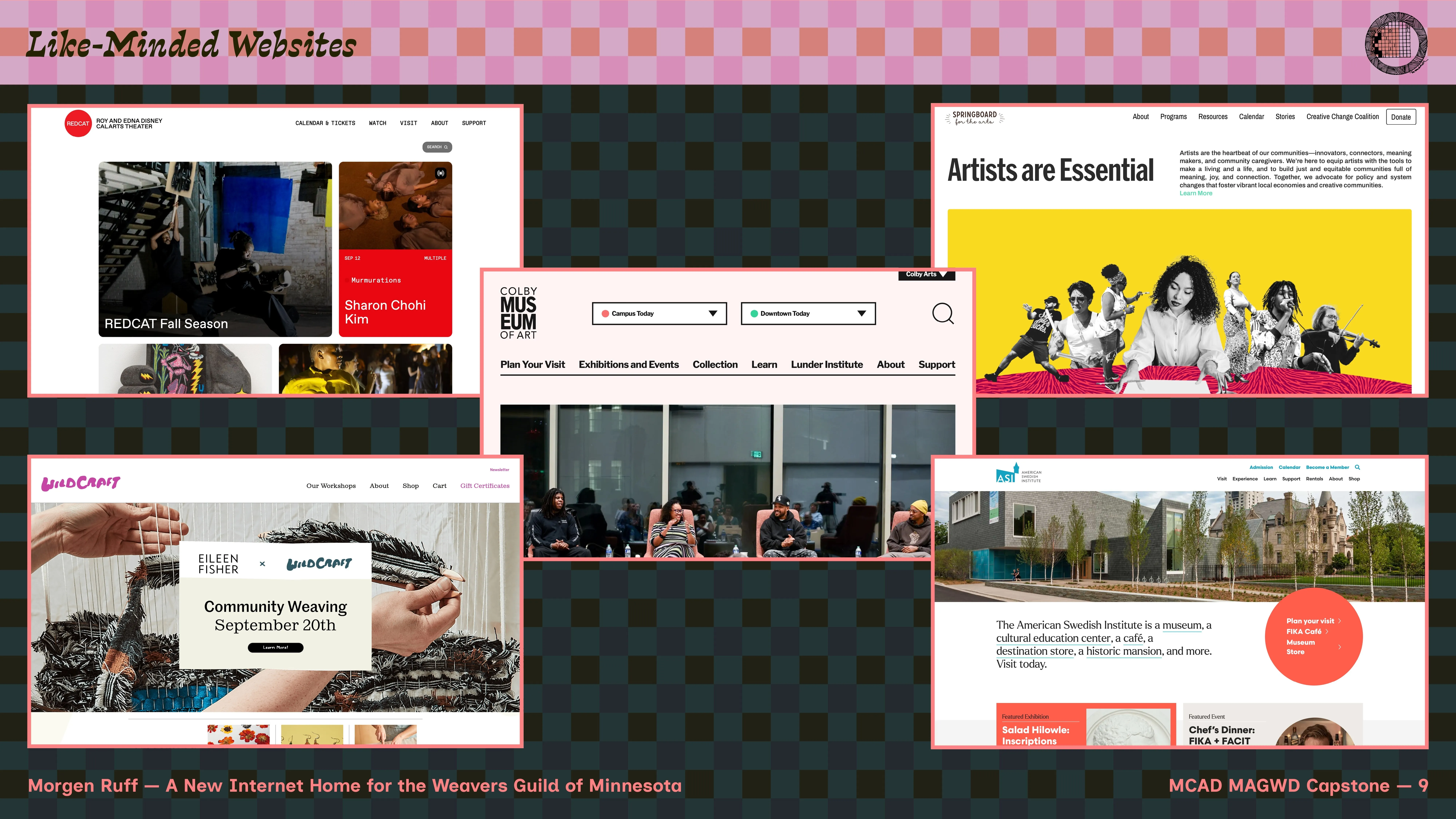
Since this project is not conceptual — in the sense that it’s a client-based project with a real-world end goal of live website deployment — my project research mainly focused on similar, recently-refreshed or -launched websites in roughly the same business space, along with nuts-and-bolts web design & development resources to improve things like accessibility, reliability, security, and performance.
Throughout the project, I worked directly with two key stakeholders at WGM — board chair Rachel Holdgrafer and executive director Betsy Konop. Through a variety of meetings and design sessions, both provided perspective, ideas, testing, feedback, and collaboration as the project progressed, allowing me to create better design work more aligned with the organization’s mission and goals.
-
Feedback and suggestions consisted of:
- color & typography feedback, particularly related to readability and existing WGM audience demographics
- information-related input — for example, which pieces of information fit within an ideal hierarchy when building the site, for both existing and new users
- structure feedback - when starting, we knew we wanted to re-organize the site because the existing version had gotten messy, but since the client knows their business best, they advised me on a good strategy to clean things up and make the site more generally legible
See references & research sources at the top navigation link on this page.
Process
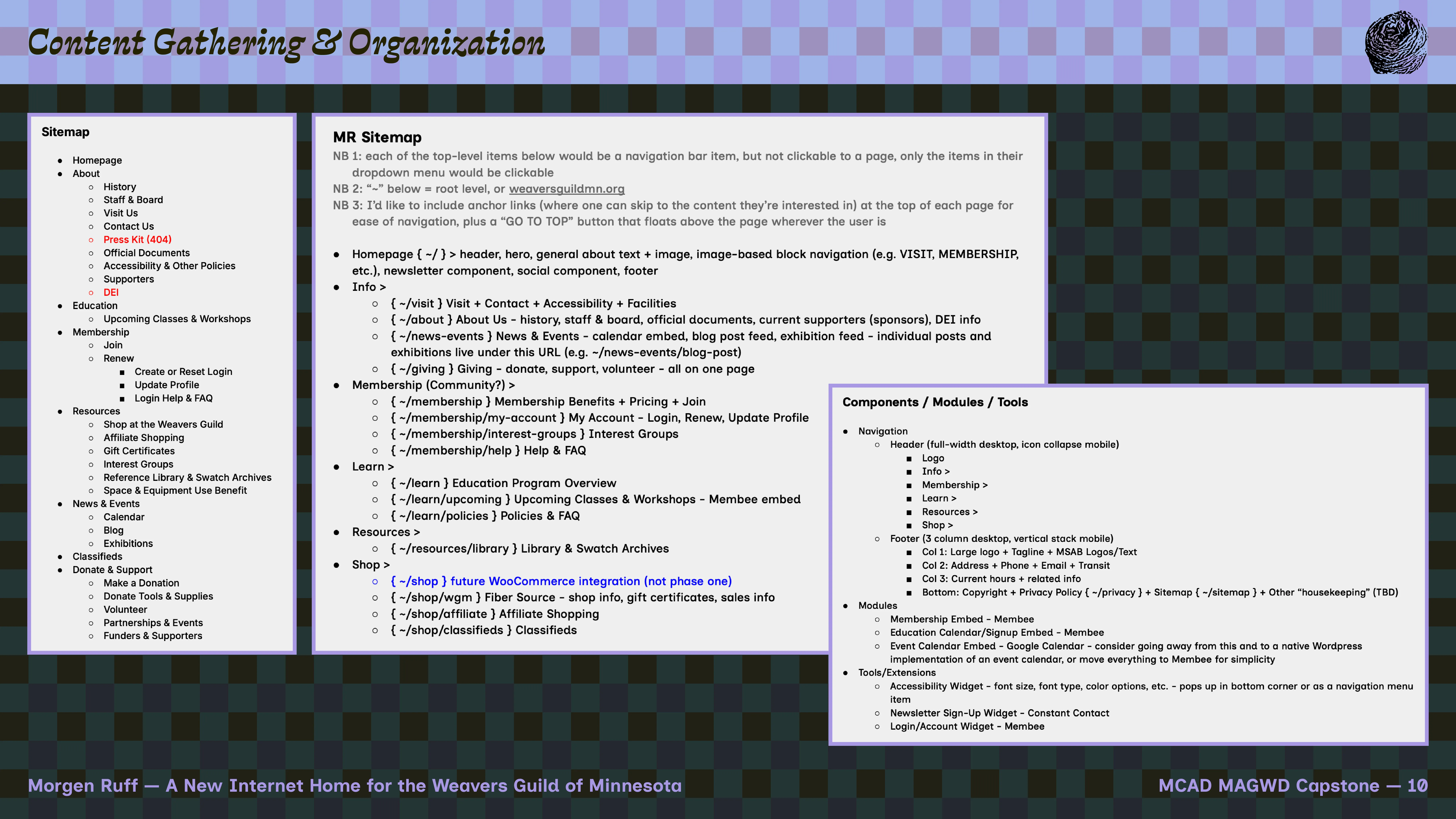
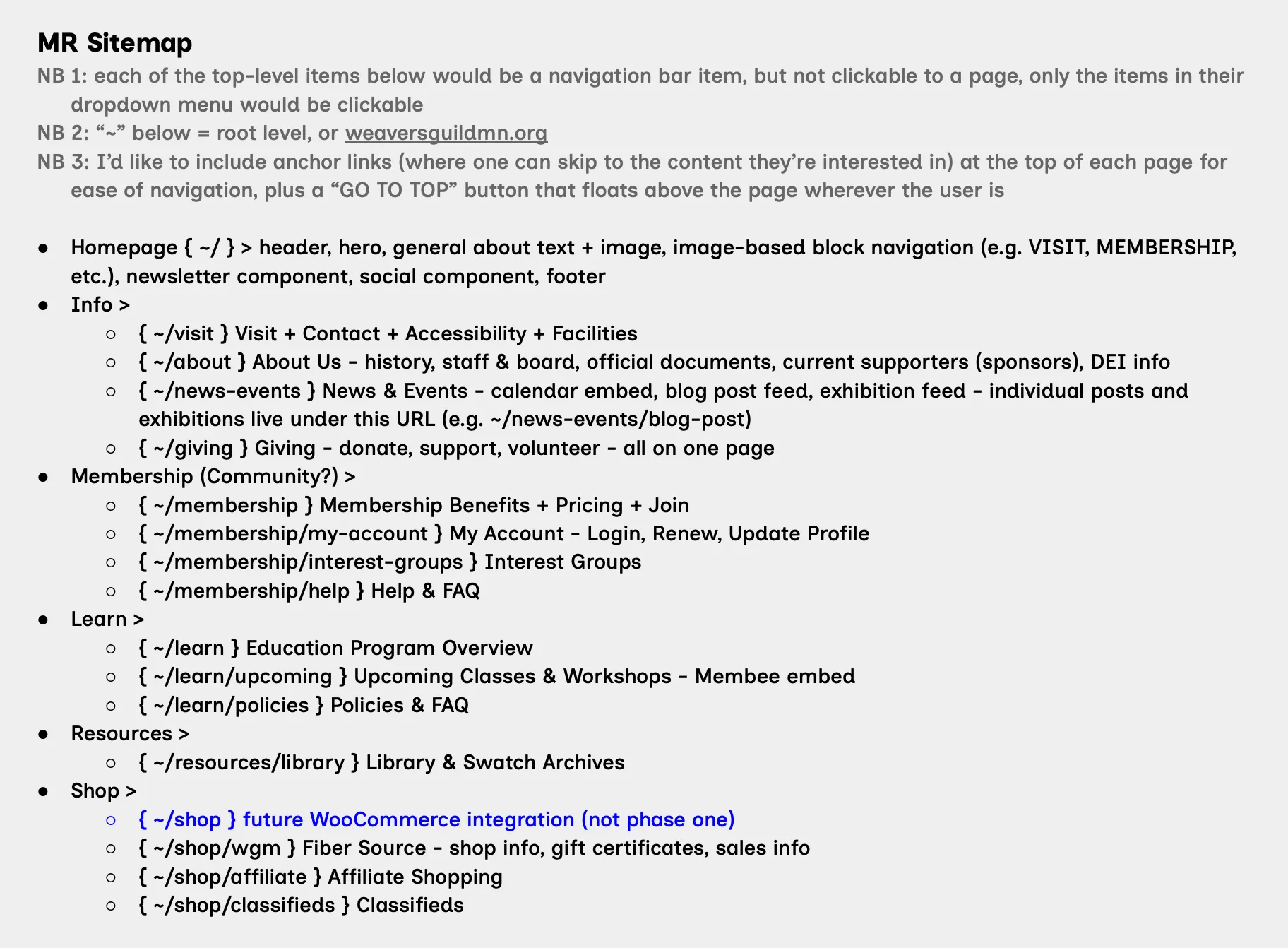
Part of the "very long document": a new sitemap proposal.
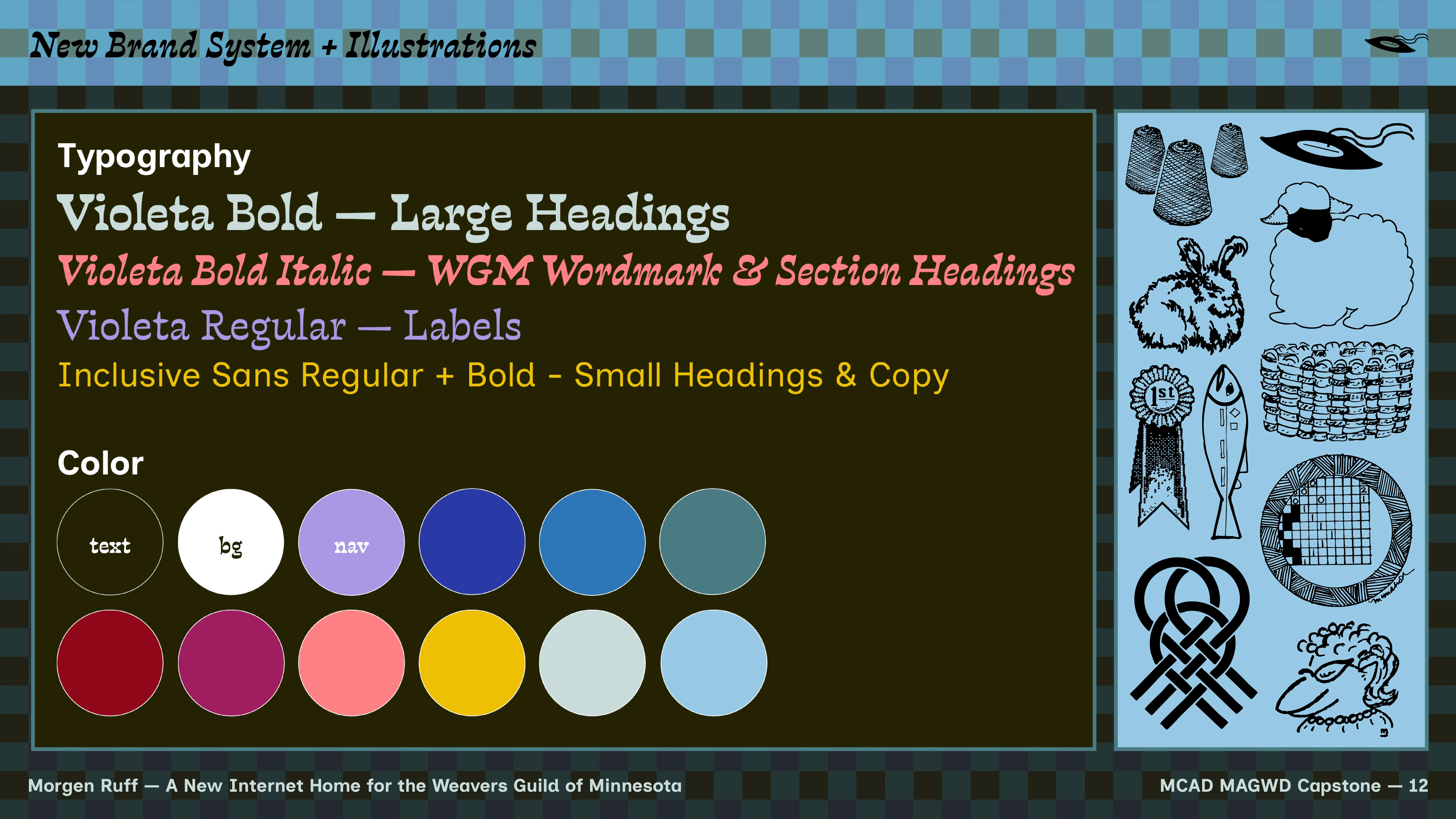
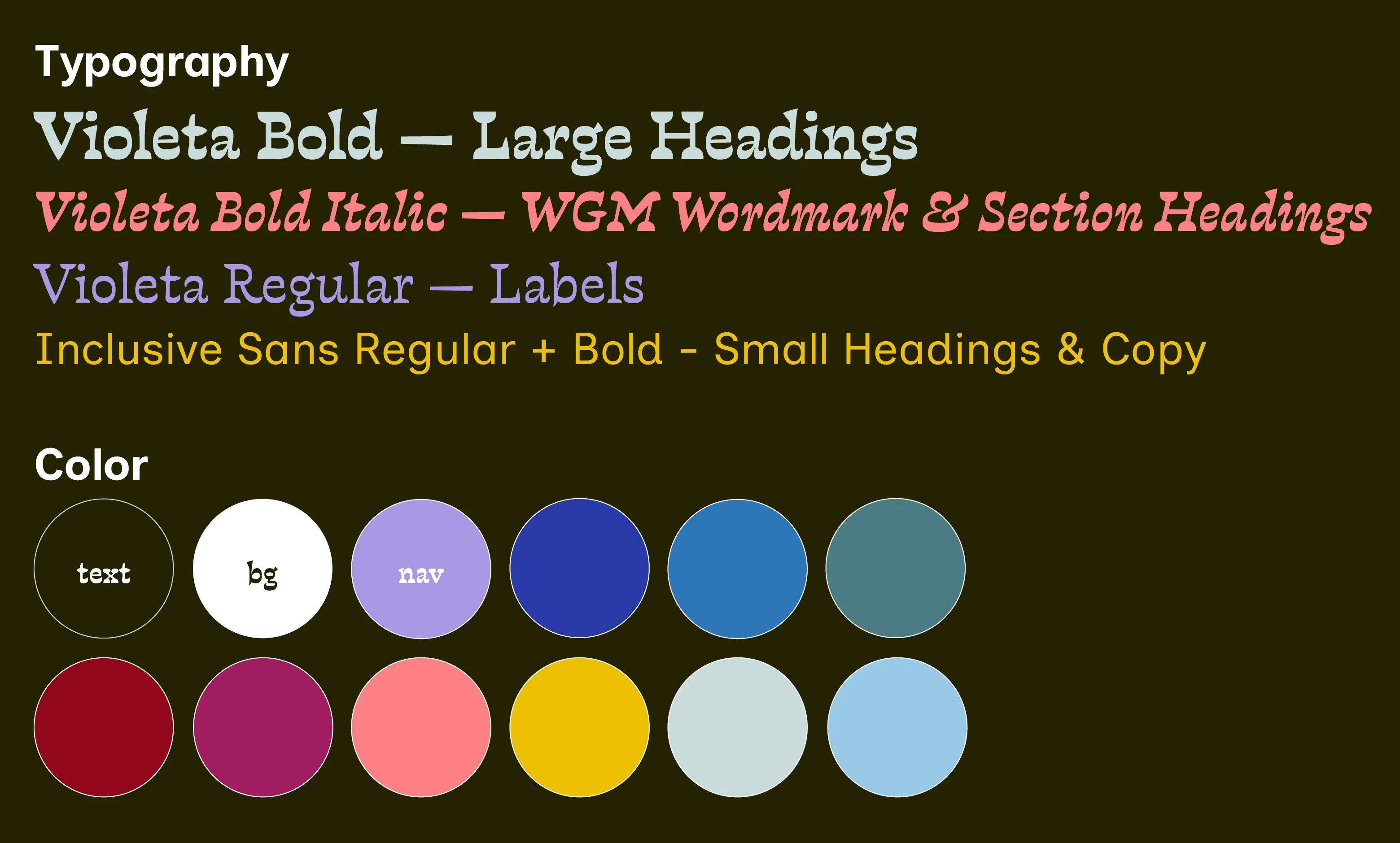
New type and color for WGM.
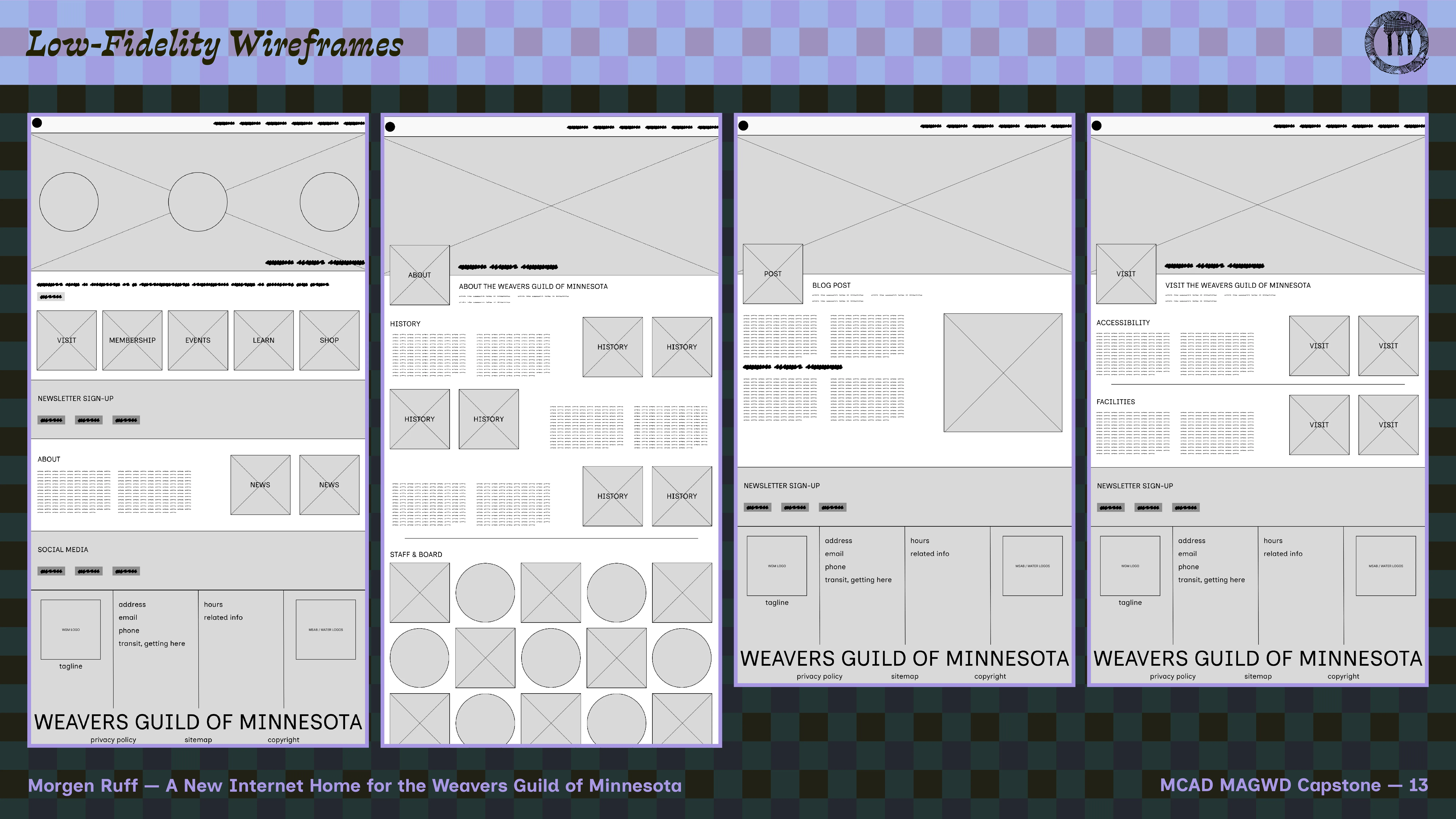
Initial wireframe for WGM homepage.
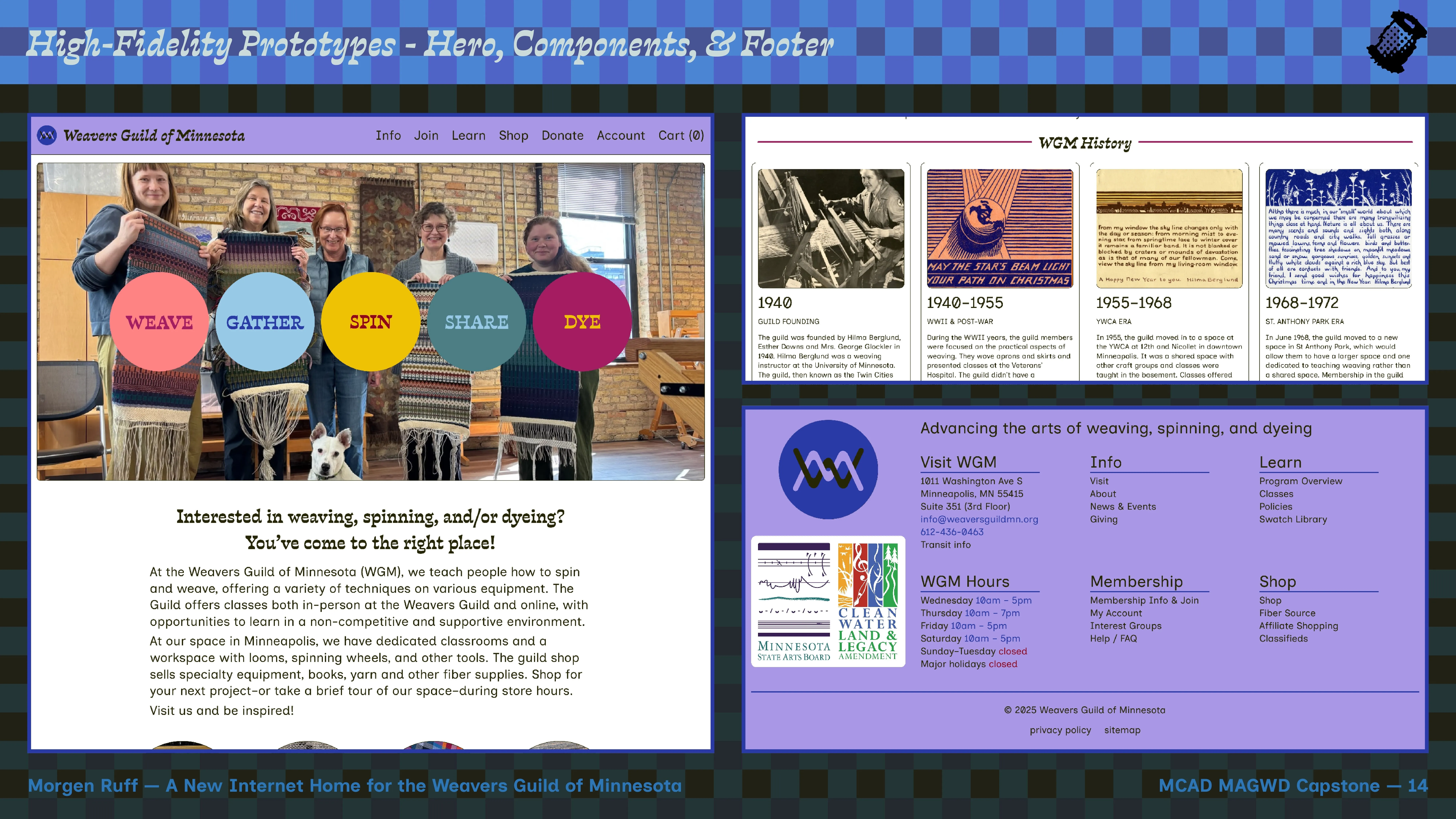
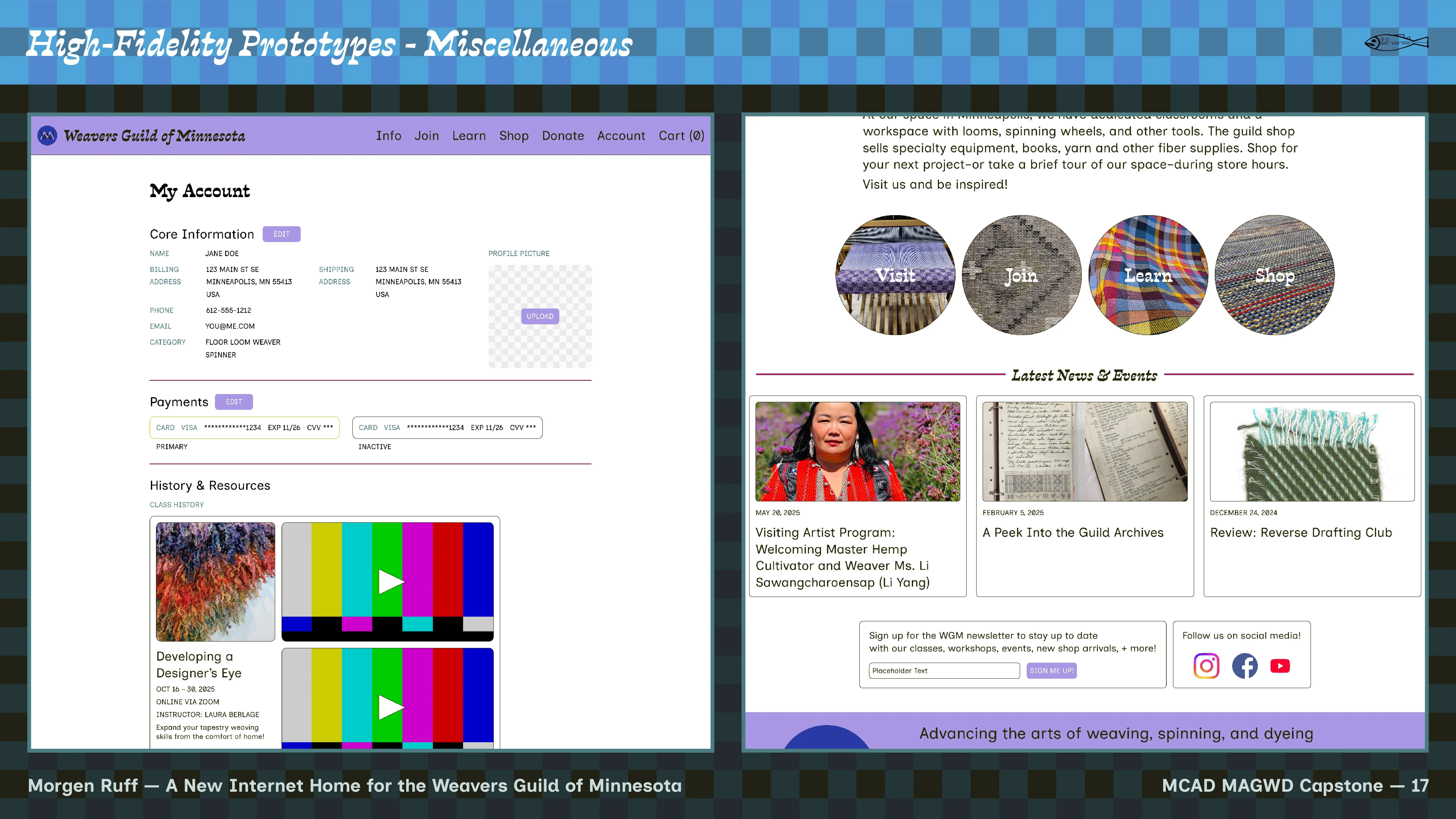
The new WGM Homepage prototype.
The new WGM 'about us' page.
The new WGM 'visit' page.
This project started in a kind of gut-feeling place: the knowledge that something about the WGM website was wrong, but not so much what to do about it. An organization like WGM does not have a lot of excess budget every year, as a small arts nonprofit they work really hard to maximize the potential of every dollar they earn. So we needed an extremely budget-friendly new website, something that could serve a much greater purpose than the financial resources put into it.
Conceptually, we sought to have the website feel very contemporary, yet have some staying power so we don’t have to start from scratch again in five years. We needed a site that is very user-friendly across demographics. Finally, we needed a site that reflects the crafts taught at the Guild while instilling a sense of joy and warmth.
First, I spent some time gathering all of the content (text, images, video, etc.) on the current WGM site, and put it all into a very long document. From there, I assessed the state of the text content and in collaboration with my partners at WGM, set about re-organizing the site and condensing disparate information down into more meaningful groups, thereby setting up a situation where the new site could have fewer — but individually richer — pages. This makes navigating the site much easier. We shifted from more academic language to more action-oriented wording to describe things one can do with the new site, simplifying the experience significantly.
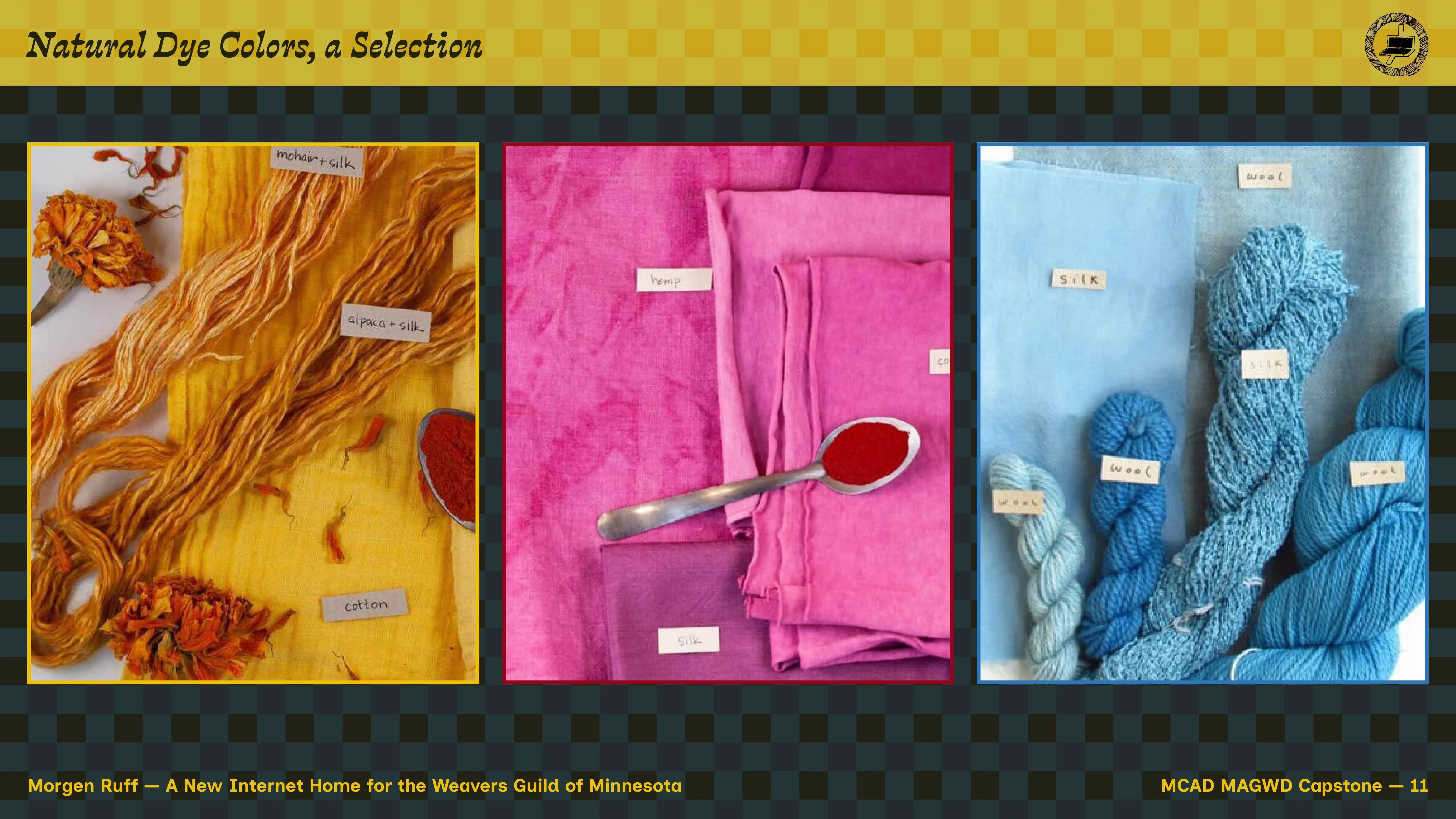
Then, onto new branding. As mentioned before, WGM’s new color palette is based on colors commonly found in natural dyeing processes, originating from native-to-MN dye plants like madder, indigo, black walnut, nettle, and goldenrod. Our aim with this new palette is to be rooted in this place we call home while providing the user with a relaxing, beautiful experience that might feel close to their own weaving, spinning, and/or dyeing practice.
In terms of typography, in collaboration we chose to break up large headings and copy. The lovely, expressive serif typeface Violeta by Javier Quintana Godoy of Quintana Type provides large headings and major focus points. The designed-for-accessibility, highly functional yet funky sans serif typeface Inclusive Sans by Olivia King provides all body text and smaller inline headings, with a particular focus on readability. Typographic contrast was important in coming to these choices.
Next, I dove into creating a wireframes of low-fidelity versions of a few potential pages for a new site, working in black-and-white and with placeholder fonts and image boxes. This passed first inspection by WGM partners without issue.
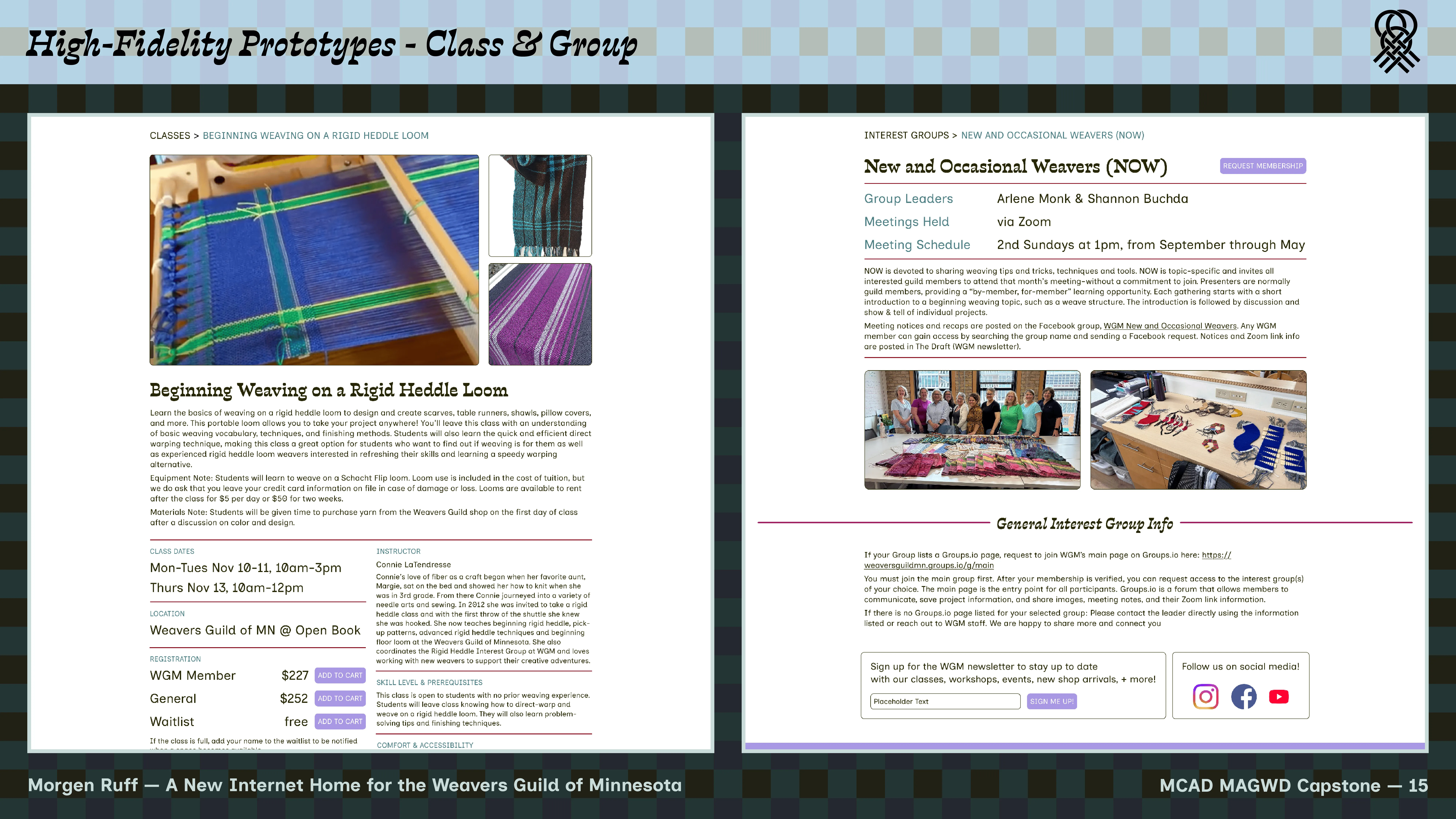
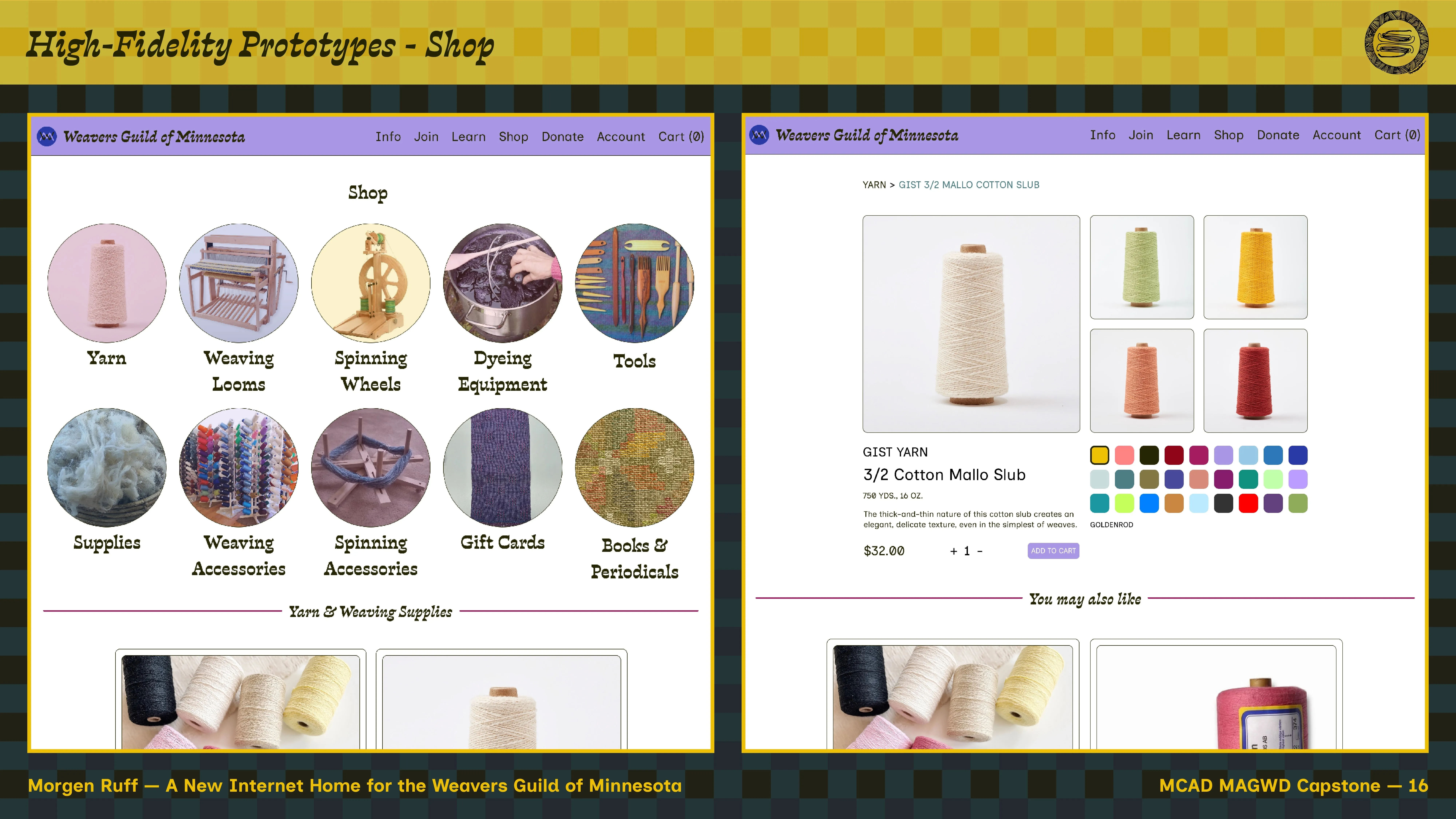
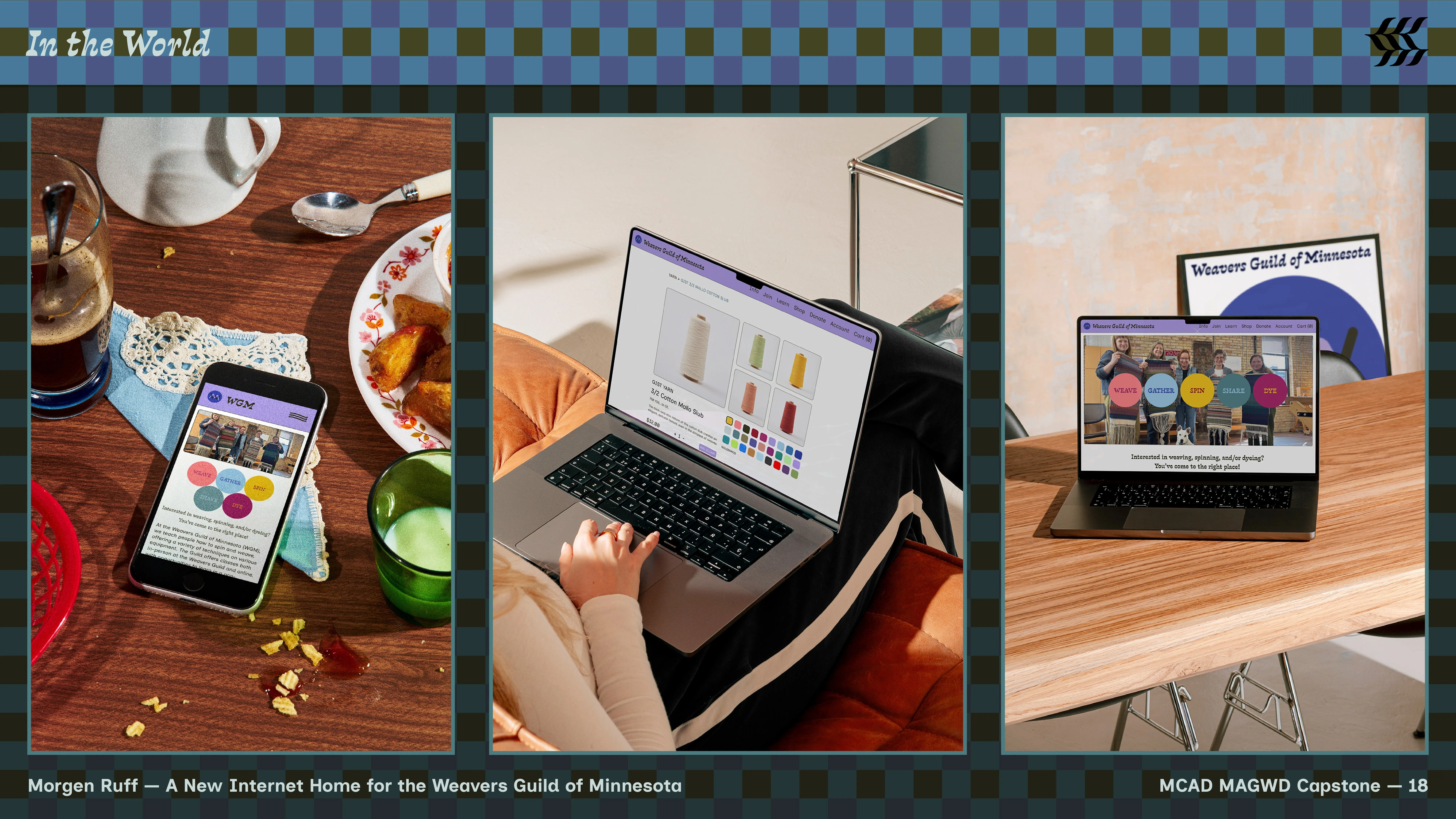
Subsequently, I moved to high-fidelity prototyping in Figma, designing most pages that will be deployed on the real website post-development. I developed a componentized approach based in high-contrast separation of content blocks, in order to avoid a “floating” feeling through the design — this is an informational site, so information should be easy to find and take in. Additionally, since the site will be built on top of the Wordpress CMS, which uses a block-based editor in its core product, the componentized approach will enable relatively easy creation of reusable blocks across pages in the live site, thus enabling page-to-page design consistency and predictability for the user. As part of my prototyping process, I always keep good CSS principles in mind, knowing both what’s possible with styling on the web and how to achieve it, but also what potential pitfalls exist when translating static designs created in Figma to a living, responsive website that follows web standards and keeps JavaScript bloat to an absolute minimum.
-
As a result, the prototypes presented here are the current state
of the overarching project, and the final result of my capstone
work. Site development and deployment will directly follow. In
development, one of the major challenges will be integrating
existing business-critical tools into the new design, including:
- Membee donor/member relations CRM, which houses information on all of WGM’s learning community
- PayPal payments processing - but thinking of switching services, still in the research phase
- Vimeo embeds linked to member records, so those who sign up for classes can access class recordings afterwards
- New e-commerce functionality via WooCommerce — currently the only online transactions WGM processes are annual membership fees, done through Membee with PayPal as payment processor
Otherwise, the plan is to develop the site with either Picostrap or Sage as a starter theme that I’ll tweak heavily to align with my Figma designs — by starting with a ready-made styling and structural framework, I’ll already have some crucial performance considerations in place. In terms of development process, I’ll rough out pages in a sandboxed development environment based on my Figma designs, then share with a larger group of internal stakeholders for testing and feedback, continue revising and feedback rounds a few times, then launch. Development will occur January–March 2026.
Project Presentation
Project presentation, December 10, 2025.

Presentation Deck
Slide Deck, December 10, 2025.